Impact
Building from real voices for real moments of need
Envoy was a formal joint venture between CHESS Health and the Addiction Policy Forum, a national nonprofit dedicated to eliminating addiction as a major health problem.
The goal was to build a dedicated mobile platform for family members and caregivers impacted by a loved one's substance use disorder: people who are often invisible in the recovery ecosystem despite playing a critical role in it.
The app launched publicly in April 2020, distributed free through the Addiction Policy Forum's channels. As the lead and sole designer on the project, I owned the experience from concept through launch.

Find full press release here
Building from real voices for real moments of need
Before any design work began, I ran a structured discovery process, the first time I had done so formally in my role at CHESS Health, and a practice I carried into every project that followed.
I conducted user interviews and synthesized insights directly from our onboarding and engagement managers, who had firsthand knowledge of how family members navigated recovery in practice. From that research I built full user personas and end-to-end user flows that became the foundation for every subsequent decision.

Primary user persona
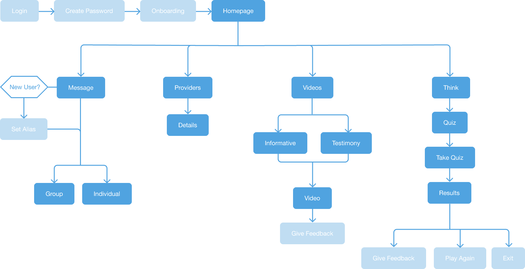
Full flow map
The research surfaced a critical insight: family members weren't looking for information. They were looking for connection to people who understood what they were going through. That single finding shaped the entire product architecture.
Users confirmed it after launch. One reviewer described it as having "a ton of very helpful resources to help families or friends who have a loved one suffering from addiction, this is so needed." Another noted it was "very easy to use" with a "wonderful option to connect with families in similar circumstances as well as clinicians with evidence-based resources." For a product serving users in crisis, ease of use is one of the most meaningful things a reviewer can say.
— darrellmichelle jaskulski on the Google Play Store
— “Drhmbrgrz” on the Apple Store
Emotional context as a design constraint
Designing for grief, fear, and uncertainty required a different set of principles than a typical consumer app. Users might be opening Envoy in the middle of a crisis, feeling exhausted, overwhelmed, or in denial. Every interaction needed to meet them where they were.
This meant designing for emotional accessibility first: soft UI, generous whitespace, low cognitive load, and a visual language that felt warm rather than clinical. The goal was a product that felt like a hand on the shoulder, not a tool that needed to be learned.


Onboarding and setup screens
Information architecture followed the same principle. The navigation was built around a single question: what does someone need in the first 60 seconds after opening this app? The full scope of potential features was mapped against user needs and emotional context. Then, prioritized ruthlessly surfacing support, providers, and resources in as few steps as possible, with everything else at the periphery.

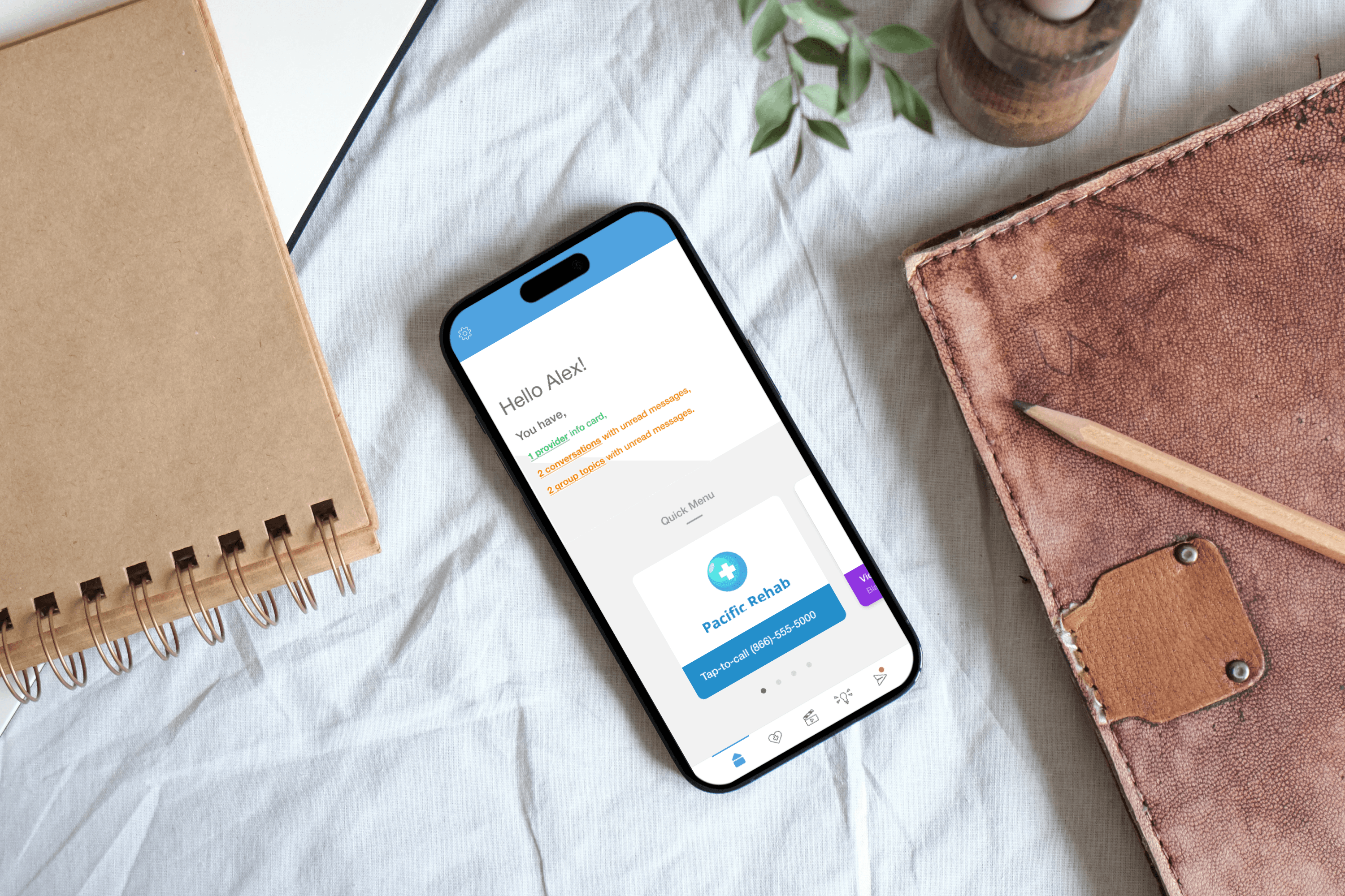
Home screen callouts
A color system built for two products at once
Most apps assign colors for aesthetic reasons. Envoy's color system was built with a different intent: create a semantic language that could scale across products.
Each color in the Envoy palette was mapped directly to a feature category, then deliberately aligned to its equivalent in CHESS Health's flagship Connections app. The result was a cross-product design language where color carried meaning, not just brand, but function.

Color system comparison between Envoy and Connections
A family member switching between Envoy and Connections would encounter the same color associations for the same types of tasks, a subtle but meaningful continuity that reduced cognitive load across the ecosystem without either product feeling derivative of the other. This system was a deliberate architectural decision made during the Envoy design phase that I proposed and carried forward into the Connections redesign, where it remains in the product today.
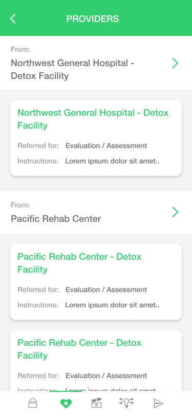
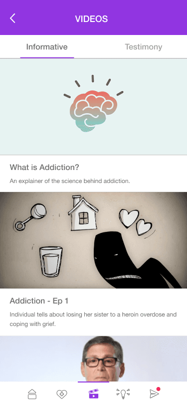

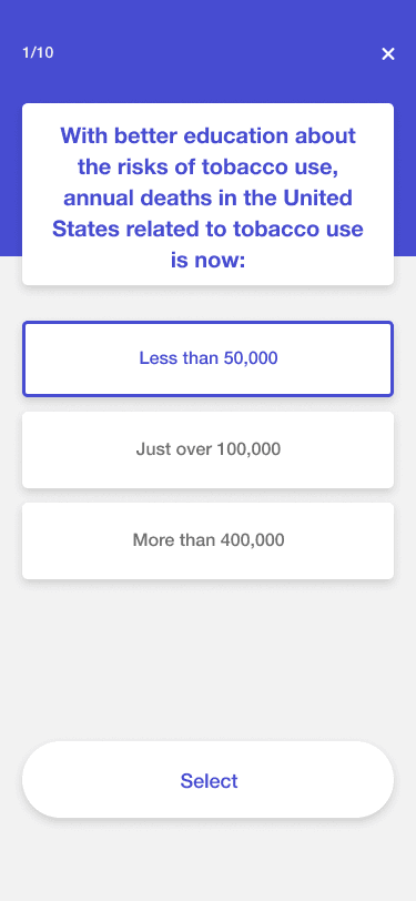
Envoy app's different features - Providers, Videos, Messaging, Quiz
Every illustration in Envoy was also created by me from scratch. The style was a deliberate choice: warm, character-driven, and human rather than abstract or geometric. For a product serving people in emotional distress, the illustration system was doing therapeutic work, signaling safety, approachability, and humanity before a user had read a single word.

Illustrations created for envoy
Three principles governed every visual decision:
Calm over stimulation. Generous whitespace and a white-dominant canvas meant the interface never competed with the emotional weight a user was already carrying.
Color as wayfinding. Feature-specific color meant users always knew where they were in the product at a glance without relying on labels or navigation alone.
Warmth as credibility. The illustration system and soft color palette made the product feel trustworthy without feeling institutional.
From logo to launch, owning the full brand
Most product designers hand off to a brand team when the UX work is done. On Envoy, there was no brand team. I designed the logo, developed the brand identity, created the App Store presence, and produced the marketing collateral, taking the product from a named concept to a publicly launched, fully branded experience.
The Logo
The Envoy mark started with the name's meaning. An envoy is a messenger, a guide, a person sent ahead to lead the way. The solution was a compass integrated directly into the wordmark: the needle replaces the "v" in Envoy, subtle enough not to interrupt the letterform but unmistakable once seen. The tagline, Your Guide Forward, completes the idea.
The logo system was built in three variants: full-color on light backgrounds, white reversed for brand-colored surfaces, and a contained app icon format for digital contexts.


Envoy logo variants
App Store Presence
The App Store screenshots were designed as a sequential narrative rather than a feature dump. Each screen leads with a single benefit statement while the device mockup shows the feature in context.
The feature color system carries directly into the presentation: Providers on green, Videos on purple, Messaging on orange. A user browsing the App Store encounters the semantic color language before they ever download the product.
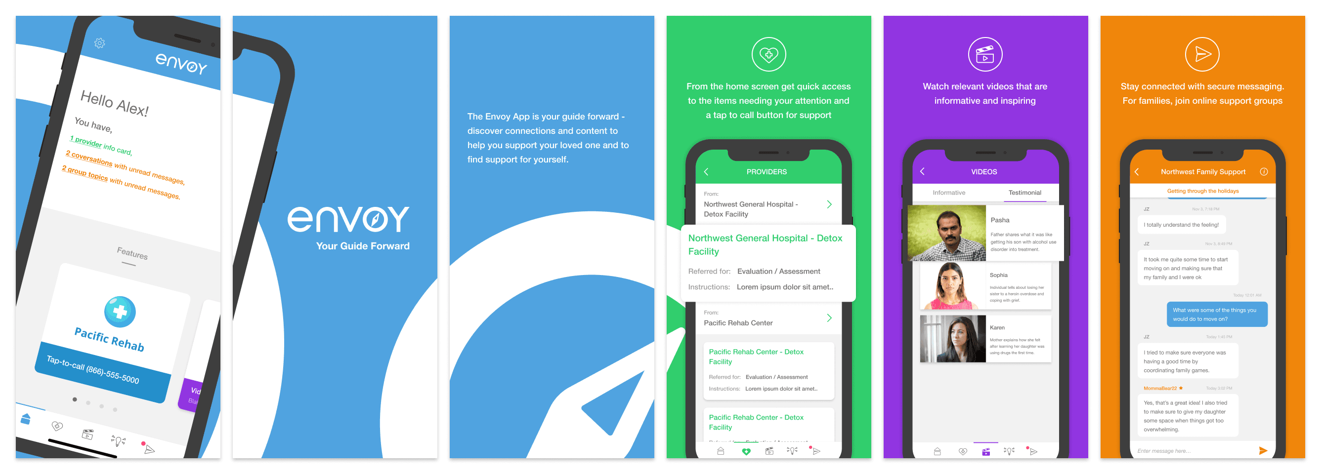
App store screens
Marketing Collateral
The postcard was designed for physical distribution through the Addiction Policy Forum's network: clinics, treatment centers, and community organizations. The copy, Safe, Private, and Free, was a deliberate answer to the three most common barriers to adoption for healthcare apps among underserved populations: safety concerns, privacy fears, and cost.

Promotional postcard
Eliminating a manual bottleneck
CHESS Health's platform supported multiple healthcare providers, each requiring their own branded version of the product. The process of generating branded assets was entirely manual and a consistent source of delays in client onboarding.
I built an automated button generation tool that took a provider's brand inputs and produced a complete, consistent set of branded UI elements instantly. The tool is still publicly accessible and was later extended to support additional asset types as the platform grew.
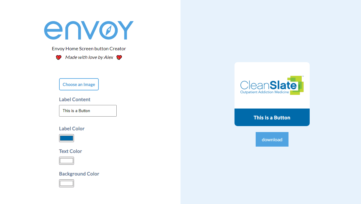
Try it yourself → envoy-button-generator.netlify.app
Click through the prototype. As you navigate between features, notice how the color shifts from the blue of the home screen to the green of Providers, purple of Videos, orange of Messaging, and dark blue of the Quiz.
That's the semantic color system in action.
A proving ground that shipped — and left a legacy
Envoy launched publicly in April 2020 as a formal partnership with a defined distribution scope. Within that scope it shipped, reached real users in real moments of need, and earned five-star reviews from the families it was built for.
What I didn't anticipate was how much it would shape everything that came after. The discovery process I introduced here became the baseline for every project that followed.
The visual identity I developed became the design language for the Connections app, a product with 20,000+ active users, and remains in that product today.
Envoy was where I stopped executing and started leading. The reach was defined by its partnership scope. The impact was not.