

The original homepage was designed more as a navigational menu with huge colorful buttons that gave minimal information. There was a lot of unused screen real-estate without really giving much useful information to the user.
Problem
Recovery is a difficult journey that many people struggle with. Without accessible ways of interacting with patients, hospitals and recovery groups have a hard time keeping their patients on their road to recovery. There also aren't many accessible resources that can keep patients not only on task but engaged.
CHESS health’s solution was to create a mobile phone app, Connections, that allows users to continuously track their recovery in engaging ways. Users had a wide variety of options from planning their schedule with medication and doctor/therapist appointments to engaging with others on their own recovery journey through a social media wall.
However, as the platform grew and design patterns evolved, Connections wasn’t able to keep with current design trends. Because of its dated design, navigation between sections was difficult and its lack of usability made it a hassle to use. It also had tons of content, but it was not presented in an engaging way for the user.
Solution
My task was to come into the app and start reworking the app section by section to bring it up to modern standards. From the start, I created several end goals in mind. Some of these goals were extensions from my previous project, envoy.
01
Redesign current sections using similar design patterns defined in envoy.
02
Create new requested sections with the same new standards.
03
Introduce new features within existing sections to further the user experience.
03
Create a friendly atmosphere that gets users excited to use the app.
Because each section was so complex that they could have served as their own separate app, I treated each as their own project. Each section had its own set of specified goals and solutions. However they all followed similar design patterns to create a harmonious and consistent platform.
The homepage was actually one of the last sections I worked on but its design was one of the first things I thought about when entering CHESS. As the first thing a user would see when starting the app, it had to send a good impression as well as reflect on how the rest of the app would feel.
For the redesign, I wanted the homepage to serve a greater purpose. Looking at other homepage apps, I noticed they not only highlighted key features, but also gave more information and content that the user would be interested in.
While creating the new designs there were some parameters to keep in mind because of the nature of the app:
01
The app is always growing with new sections and features being introduced.
02
One of the main draws to the app is its customization on a provider level.
03
There is a wide range of users in different age groups.
On top of redesigning the homepage, I also designed the onboarding pages that the user would see when they first logged into the app.
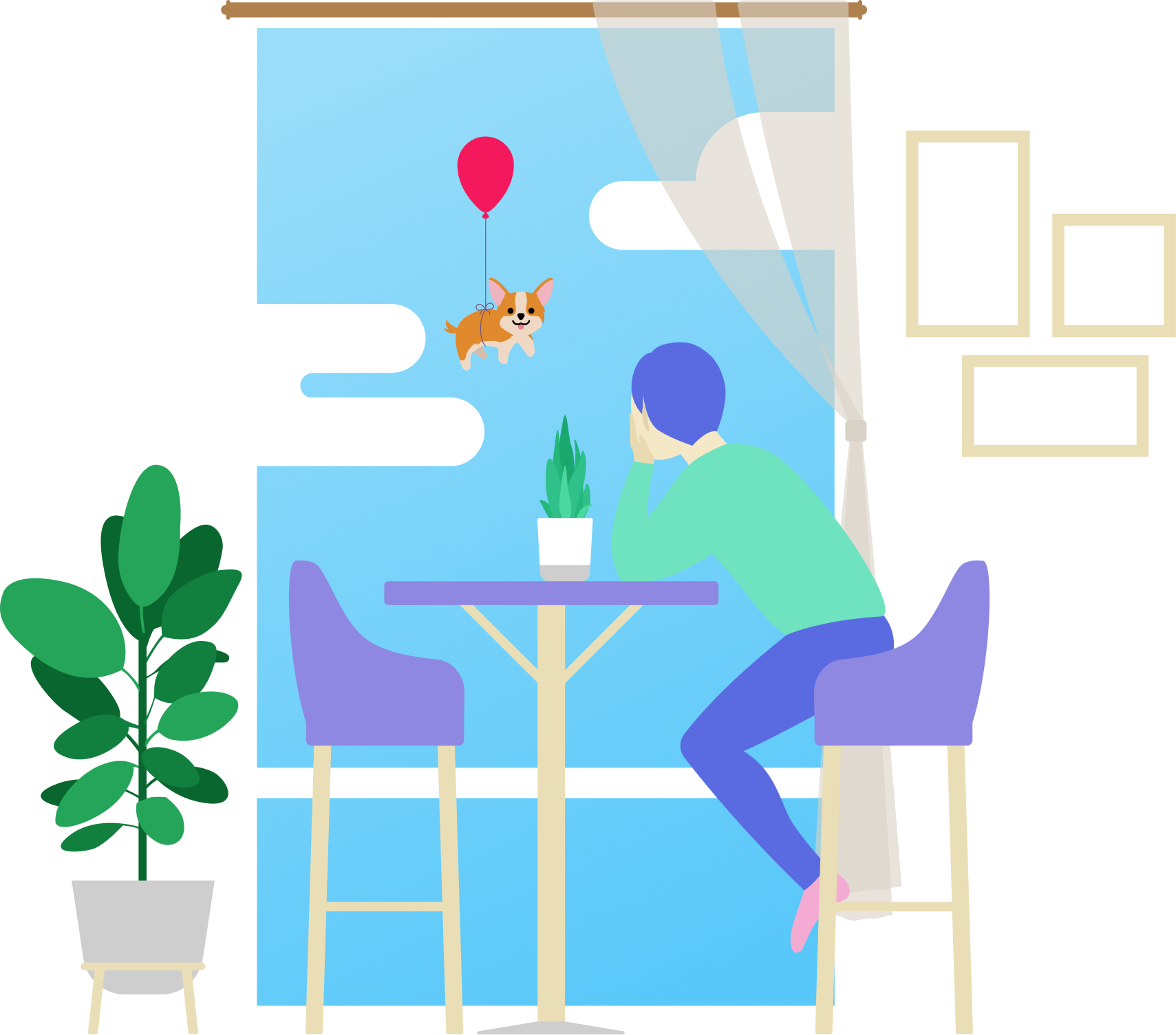
While researching onboarding pages, I noticed that most of the aesthetic designs incorporated illustrations to introduce the users to its key features in a fun way.I wanted to do something similar. By using bright, colorful illustrations, I could set the tone of the rest of the app.
Designs
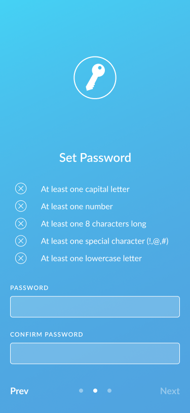
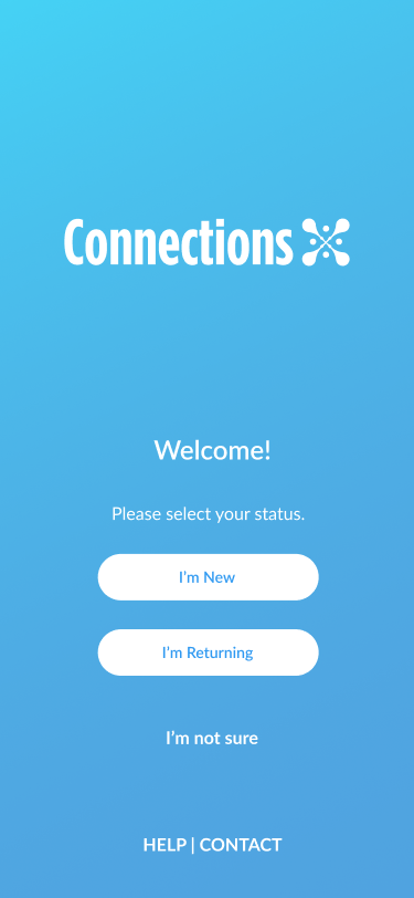
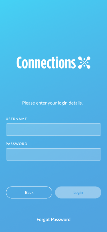
Login
For the initial Login pages, I wanted to keep the length as short as possible while getting all the necessary information. Because of the nature of the users, I didn’t want to lose their attention because of a difficult account creation process.
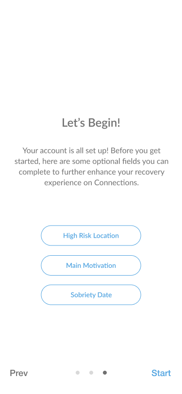
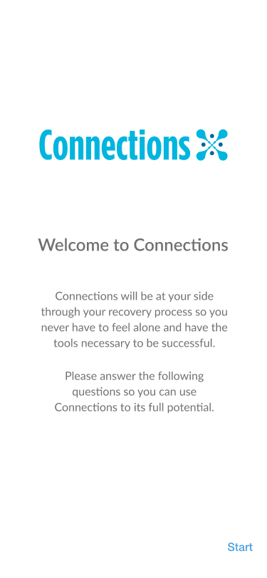
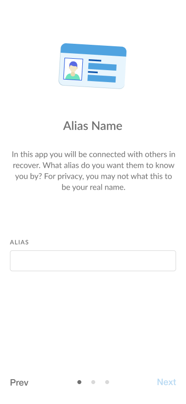
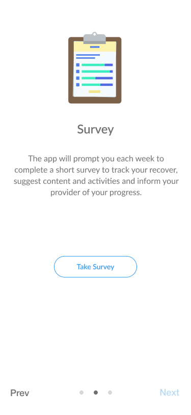
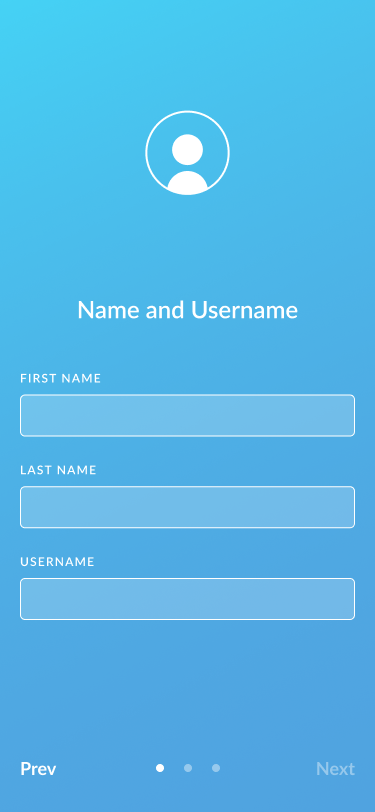
Onboarding
For the onboarding pages, I kept the design simple by pointing out some key features with the added option to set up their account with the necessary information for each of the sections. It also includes a matching illustration that borrows an asset from the described section to link it visually.
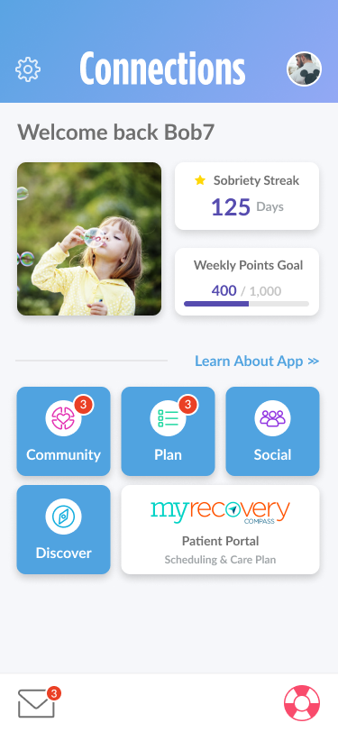
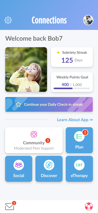
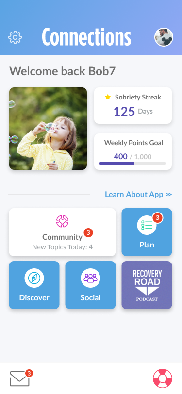
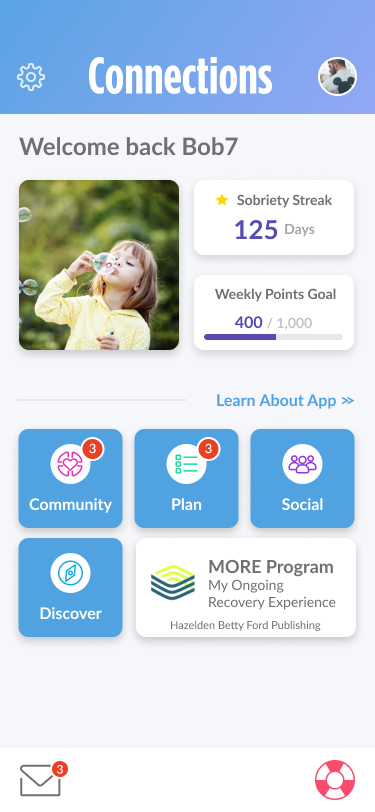
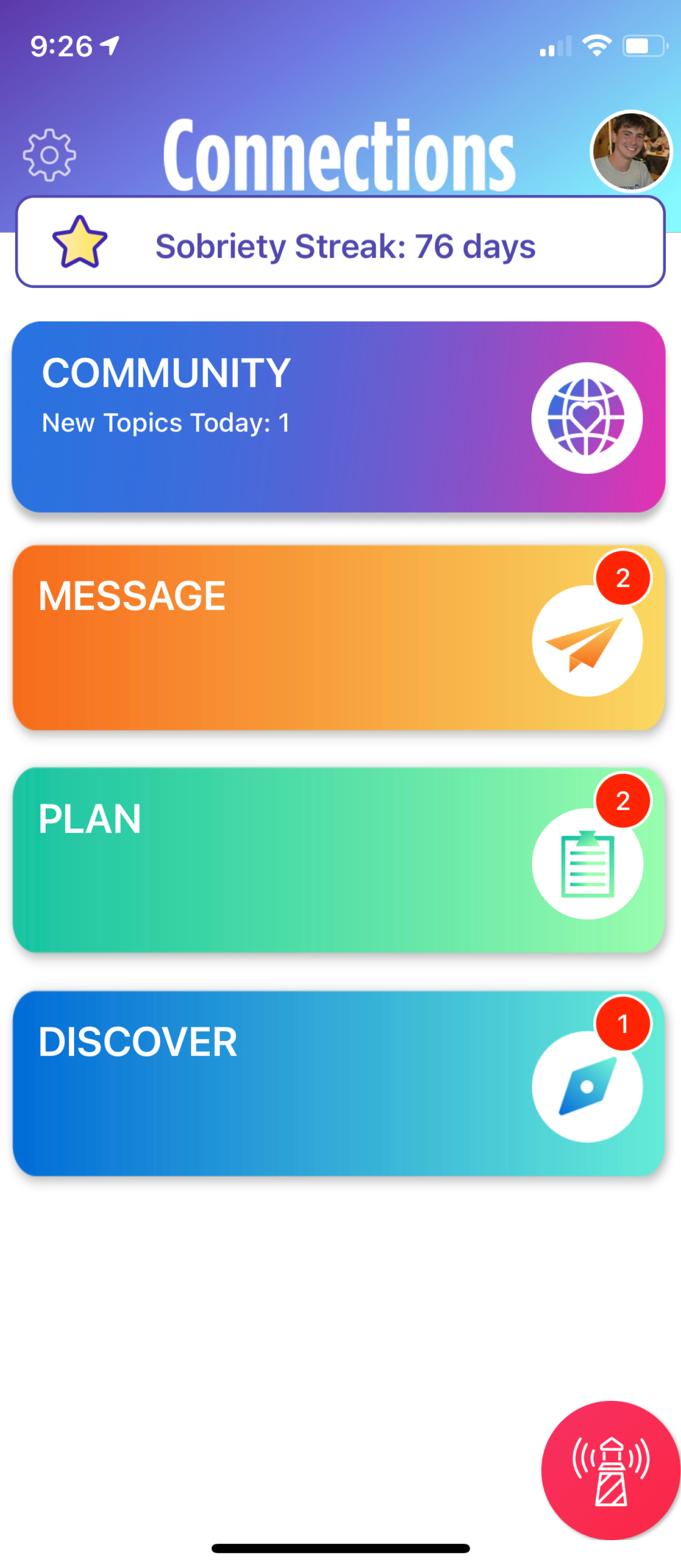
Homepage
The new homepage consisted of all the features of the previous design plus more. In an attempt to prevent alienation of precious users, I kept all the sections navigation on the homepage with simple iconography and a more conservative use of color.
I also wanted to emphasize its modularity with card-like buttons that could be adjusted in size. That way, new features and custom buttons could be added freely without altering to design.
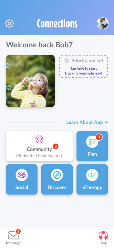
Homepage: Upper Section
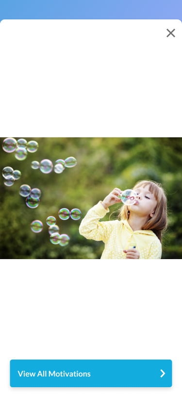
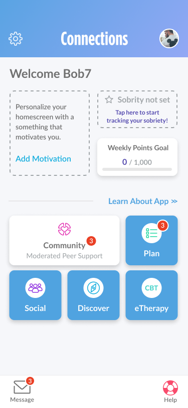
With the increased screen real-estate, I wanted to bring to the forefront some new features that would bring more practicality to the homepage. With the addition of gamification, there would now be a quick overview on daily user goals. It would also house the user’s self defined main motivation as a way to remind them why they are on their journey.
Conclusion
The Connections app was the reason why I was hired for the position and what I had been working on from day 1 with CHESS Health. It allowed me to learn about a unique group of users that had their own specific use cases and needs. I learned about accessibility that molded my design philosophy into what it is today.
I was also able to hone my strengths such as illustration and UI Design at a high level. While envoy was my baby because of my involvement from start to finish, I consider Connections my magnum opus of my time in CHESS. Seeing it go live gives me a great sense of pride knowing that my designs are being used by some extremely vulnerable people. It inspires me to continue working and improving with the mindset that somewhere, someone is using something I created to better themselves.