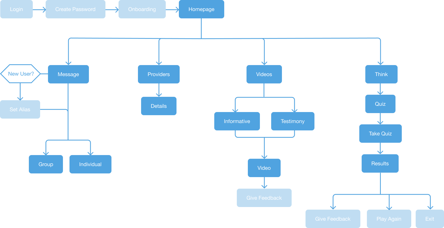
Homepage
For the homepage, I paid additional attention to the design, as the wireframes for the original Connections were repurposed for this project. A similar floating card design was adopted into Connections.

A resource for those who may need a little help on starting their recovery journey.
Envoy is an application designed and developed under the need of a lighter weight version of CHESS Health’s flagship app, Connections. As the sole designer of this project, I had almost complete creative control on the design and I wanted to use this chance as a way to pave a new design system that could be used across all of CHESS’s platforms. I worked with developers and the front facing team to form an accessible and simple experience that would introduce the recovery process.
UX Design
UI Design
Illustration
Front End Development
The recovery process can be a tough journey. Without the proper resources and guidance, even starting becomes a daunting task.
There's an overwhelming feeling of isolation and helplessness that comes when faced with this problem when proper help can't be reached.
Envoy is a recovery app meant to give resources to users who may need an intervention to start their recovery journey. It also allows users to actively chat with their doctors or participate in group discussions with others who may be experiencing something similar.
The designs for this project were particularly important because they were meant to serve as the blueprints for future projects. With that in mind, I wanted to make sure I decided on a consistent and pleasant design language that I could later introduce to Connections when it got its own facelift.


I used softer colors with rounded boxes and colorful illustrations to create a friendlier atmosphere.
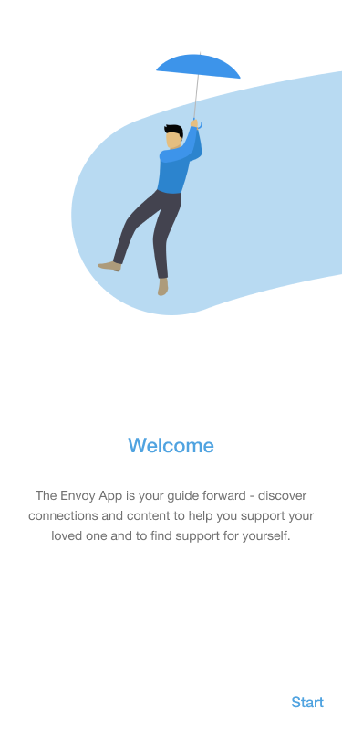
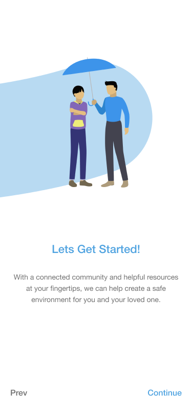
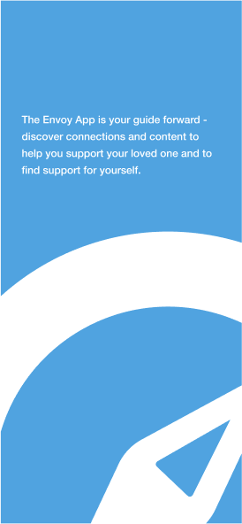
As the main introduction to the app, I wanted to set the tone immediately for users. I used cute illustrations that connected with a line to tie each slide together. It was also a fun way to visualize each main section of the app.
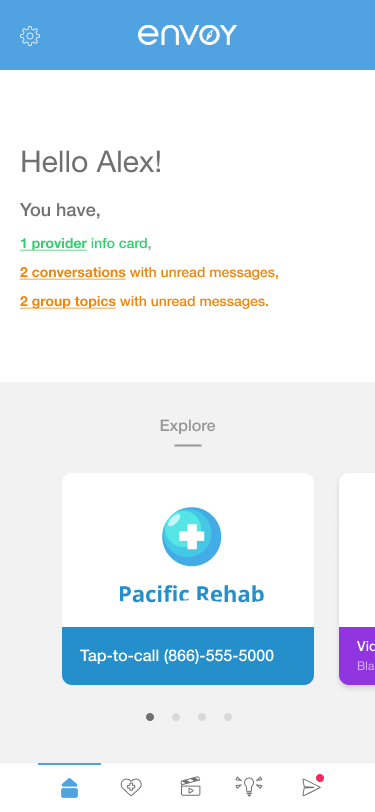
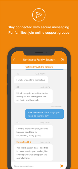
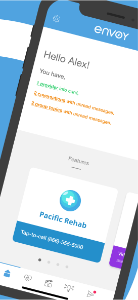
For the homepage, I paid additional attention to the design, as the wireframes for the original Connections were repurposed for this project. A similar floating card design was adopted into Connections.
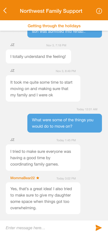
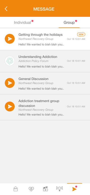
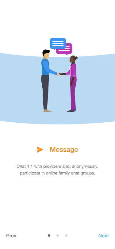
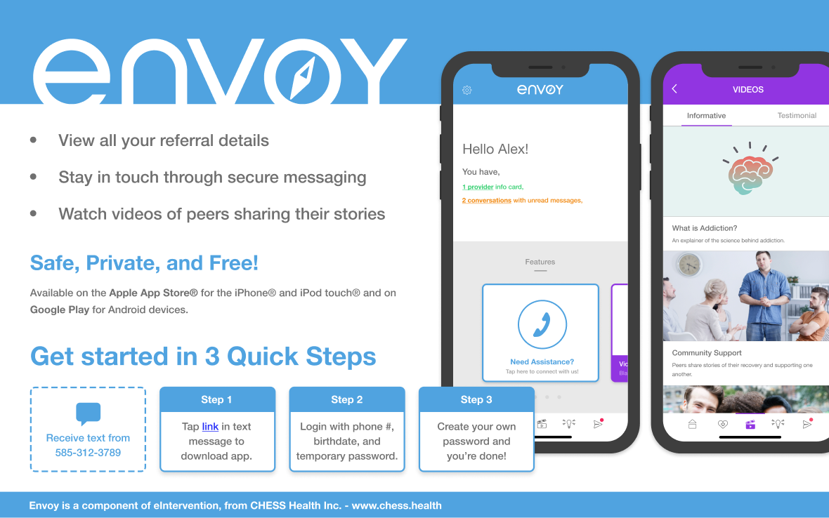
The Message section lets patients interact with their providers and participate in group discussions with others who may be in the recovery process.
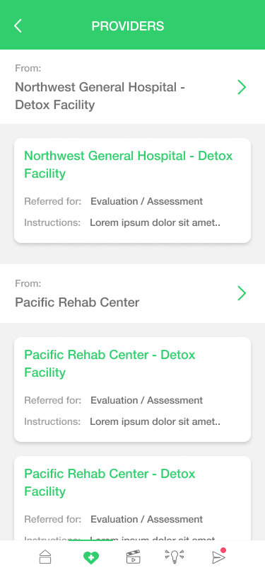
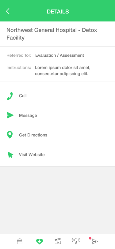
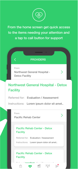
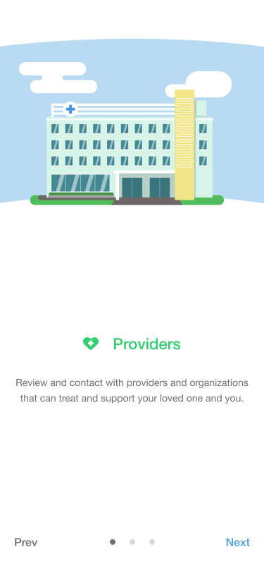
Here, users can check the contact information and locations of providers for quick access to resources.
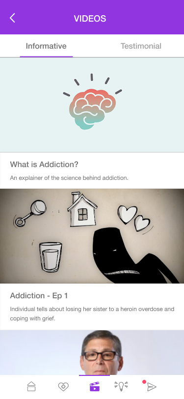
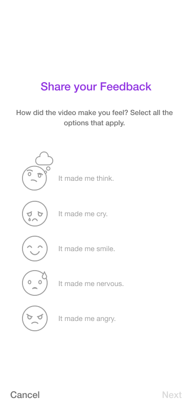
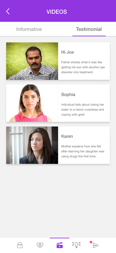
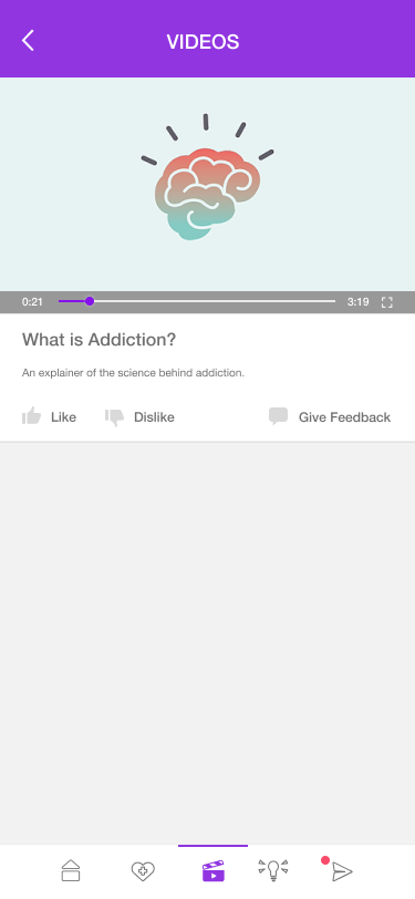
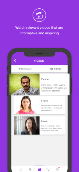
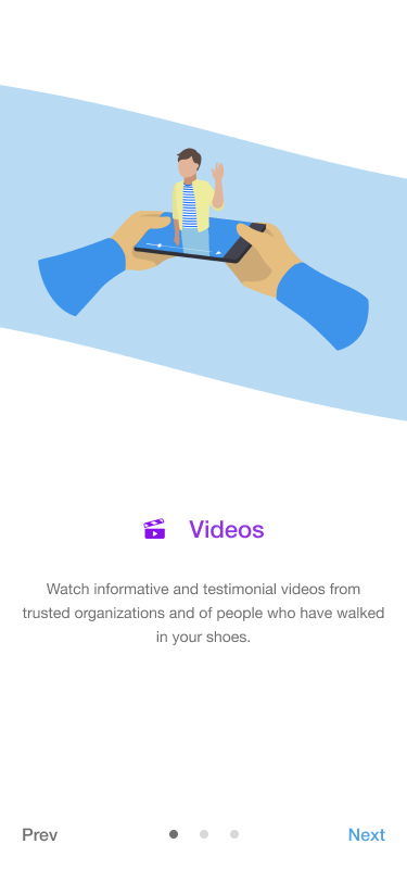
CHESS health has a variety of video resources that can describe the recovery process. By allowing the user to learn about the journey, we were hoping to get users more comfortable with the idea of going through with recovery as well as dispelling any potential myths.
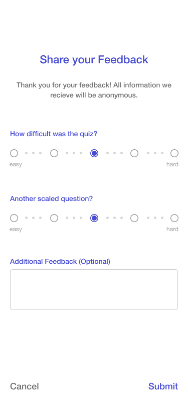
We also added a feedback option for users to give input on how some of the content made them feel for our front facing team to use to better understand what videos we should look for in the future.
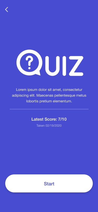
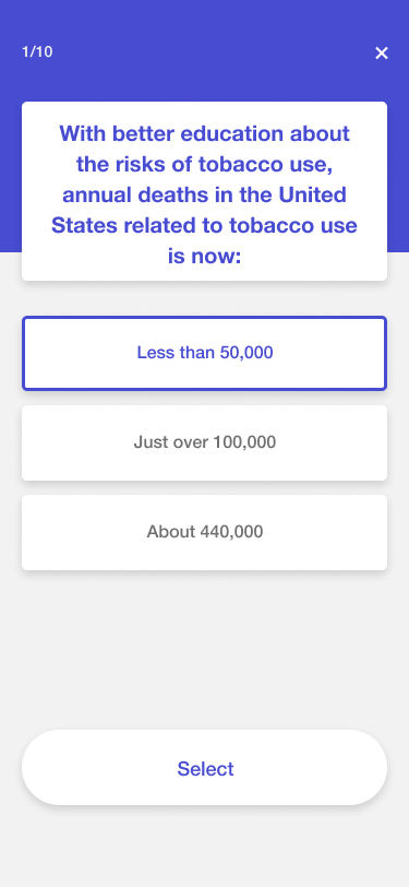
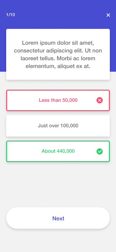
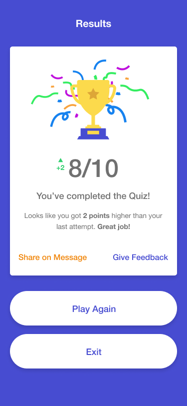
This was the final section created as an ad hoc idea for extra user driven content. We wanted a fun section for users to test their knowledge on recovery in an interactive way. It would also give providers a chance to create their own interactive content for users in the future.
For starters, we wanted to create a small postcard sized flier that could easily and quickly explain envoy and its core features. That way, providers could have a physical hand out that they could give to potential users.
For the app store, I created some fun, connecting slide designs that showcased some of the key features in the app. I also used them to show the friendly vibe of the app.
The last piece to this project was something that came as a self driven project, as it wasn't requested to be done. Envoy has custom buttons on the homepage that can be customized by providers to match their brand. The front-facing team regularly gave demos of envoy to potential customers and wanted to really focus on customization for providers so they would regularly come to me to create a button design for the page.
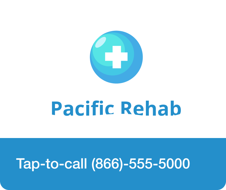

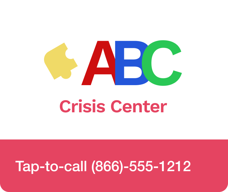

Eventually, I realized that this process could be automated, and thus I requested to create a tool that would automate the process and got approved.
The first step was looking at changes needed between button content. The logo and the text content were always different so I started with those. I created a simple HTML page that would take in an image and a text string and generate a rendered image of what the button would look like. Then I got requests for the ability to change some of the colors to further match the provider's brand. Finally, I added some more color options to fully customize the button and a download button below the rendered image so users could download the image.
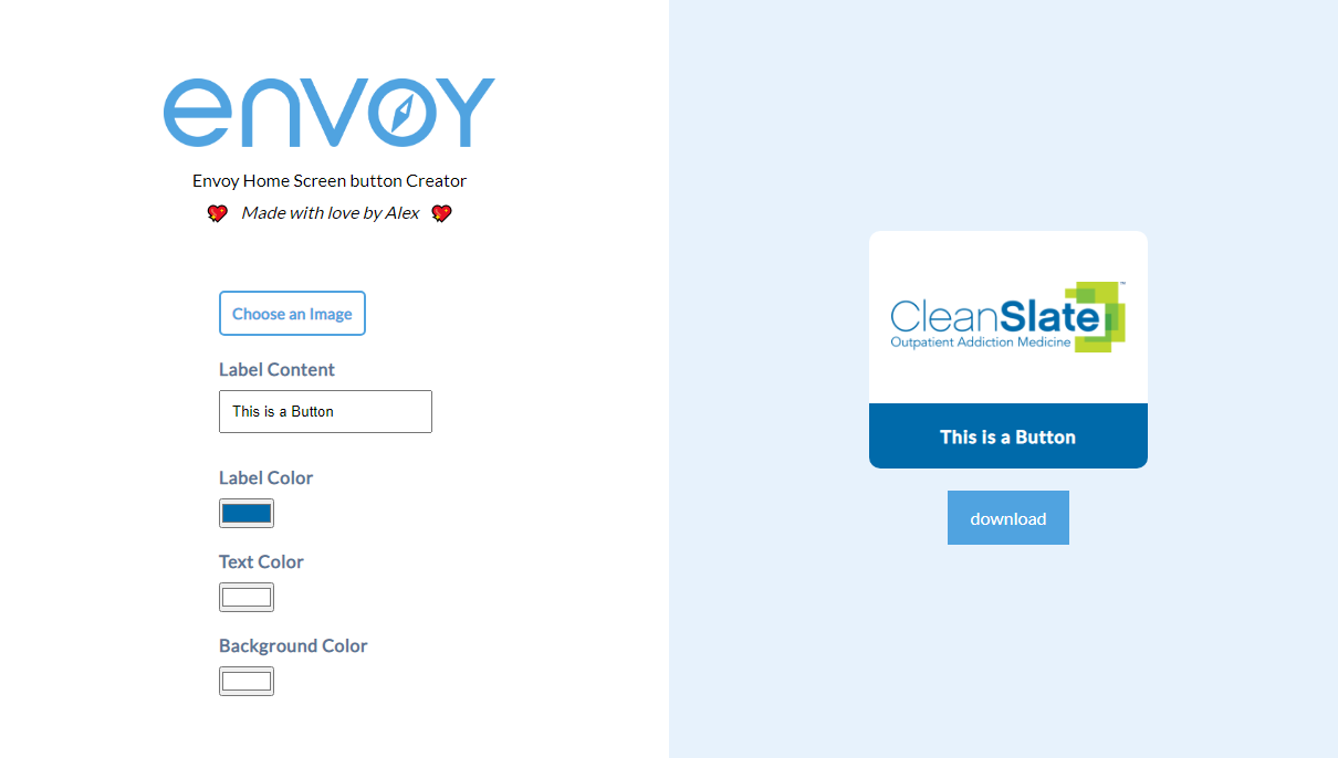
It was a simple project that allowed me to freshen up on my coding and create a tool that could be used to future-proof the app further by creating consistently designed buttons.
Envoy was my first big project that I had complete agency over as the sole designer. I focused on a clean and clear user experience while using colorful illustrations to liven up the designs. I took the chance to show what our flagship product, Connections, could look like.
If I had the chance, there are certain aspects I would further improve on, such as better navigation and searching through videos and a slightly updated color scheme. However, I am very proud of this project and learned a lot while working on it.