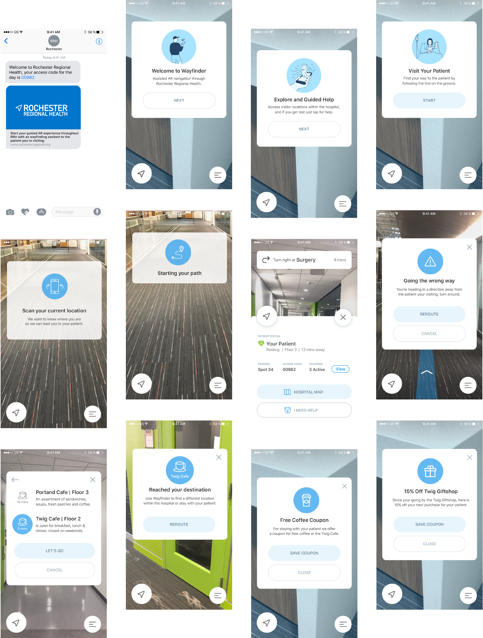
Wayfinder hero

Wayfinder

A simple and elegent solution for a complex navigation problem.

Abstract

Rochester Regional Health Hospital requested to do a collaborative project with RIT and my senior class was given the task of fulfilling their needs. They wanted an AR navigation system that would allow visitors to get to specific areas of the hospital with as little friction as possible. My team was called team ROAM and consisted of two other amazing designers: Madison Yocum and Victoria Bragg.

Roles

Prototype Animation

UX Design

UI Design

Problem

Hospitals are a stressful place and navigating the space can cause a lot of problems to the visitor, the patient and the hospital staff. With this in mind we thought about our individual experiences at a hospital and thought of 4 major pain points as a visitor:

  • 01
    In an emotional state

    Patients and visitors experience stress and confusion when entering a hospital, resulting in emotionally charged actions.

  • 02
    Complex navigation in hospital

    Hospital spaces are complex and vary in size. This makes navigating a hospital extremely difficult even for a returning visitor, as pertinent information such as patient location and status are always updating.

  • 03
    Not clear what to do next

    During a hospital stay or visit, after checking in and navigating to an area, there is a disconnect when trying to navigate to the next location such as a bathroom or lounge.

  • 04
    Unknown patient information

    As a visitor, knowing where the person you’re visiting is located and their current status is critical. There is currently no optimized communication link between patient and visitor.

Research

After putting together our research direction based on the four major pain points we identified, we decided to research the hospital setting as a whole. We interviewed hospital administration and their biggest issue they found was visitors asking this question:

"Where do I go?"

Based on that statement we decided to limit our scope to a visitor who is coming to see a patient, rather than an entire slew of user types.

We also found that hospitals also run like a business as well. For starters, hospitals are required to keep certain information private about patients in order to abide to HIPAA laws. Using an AR in this kind of setting brings up an awkward conversation about privacy protection. Hospitals also need money and thus, desire benefits that come in through these kinds of applications.

  • Lessen emotional stress
  • Bring benefits to the hospital
  • Inform visitors during a visit
  • Communicate with patient

Once all of our research had set us in a solid direction, we decided to move onto our user flows. We had a basic idea on how we wanted to present our app and created two flow that showed off the main essence of our project.

User Flow 01: Onboarding

User Flow 02: Navigating

Design

We wanted our designs to calm a user with playful interactions and illustrations without going too far and making it look childish. We used very simple illustrations that visualized the onboarding process and set an initial mood for the app. From there, simplified illustrations were used for other call outs to further balance the mood. We went for a monochromatic design to create a simple and easy to view UI with rounded boxes and circular buttons to further the friendliness of the app.

Solutions

Our main goal was to simplify navigating a hospital while fostering a friendlier vibe for the user. Using fun and simple animations while keeping in mind where UI lived in the space, we were able to create an enjoyable navigation experience.

iphone mock
Onboarding

The introduction to the app should be simple, friendly and not overwhelming. By on boarding the user from the start, we are giving the user information about the application as well as a simplified instruction on what to do after downloading the app. This way the user wont download the app and get confused on what to do next.

iphone mock
Patient Status

The user will always have quick access to the patients status by entering a menu on the bottom. With that information on their fingertips, they can quickly deduce where their patient is and their current status as well as personalized information of the visitor, such as parking information and available coupons available for use.

iphone mock
Alternative Destinations

The user will always have control on where they are going. There will be an option that will allow for the user to explore other locations with-in the hospital, whether it be the nearest cafeteria or bathroom. Then it will automatically reroute the user to the selected destination.

iphone mock
User Incentives

Throughout the visit users will be provided with coupons to further enhance their hospital experience. This will also give a user a desire to download and use the app.

Conclusion

I think that everyone can agree that visiting a hospital is stressful. By creating this application, I wanted to understand that process better and try to create an experience that is more enjoyable. It also allowed me to practice my UI animation and prototyping.